Manual Integration: X Theme
To integrate HeroMenu within X Theme, follow the steps below very carefully.
Take Note
Start by making a backup of the files mentioned on this page. Please also note in future that theme updates by the author might overwrite the _nav_primary.php. So make sure that when you do a theme update, also do this bit in the _nav_primary.php file again.
Wrap the following code within _nav_primary.php.
File location: framework » legacy » cranium » headers » views » global »_nav_primary.php
<a href="#" class="x-btn-navbar collapsed" data-toggle="collapse" data-target=".x-nav-wrap.mobile">
	<i class="x-icon-bars"></i>
	<span class="visually-hidden"><?php _e( 'Navigation', '__x__' ); ?></span>
</a>
<nav class="x-nav-wrap desktop" role="navigation">
   	<?php x_output_primary_navigation(); ?>
</nav>
<div class="x-nav-wrap mobile collapse">
	<?php x_output_primary_navigation(); ?>
</div>
With the following:
<?php if( !class_exists( 'hmenu_frontend' )): ?>
	[ CODE TO BE WRAPPED ]
<?php else : ?>
	<?php wp_nav_menu( array( 'theme_location' => 'primary' ) ); ?>
<?php endif; ?>
Menu Location Settings
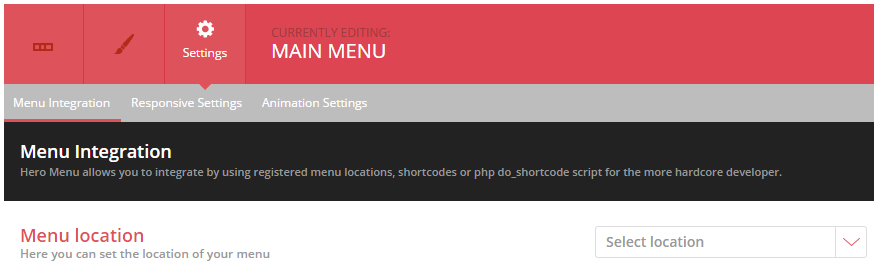
Navigate to Hero Menu » Settings » Menu Integration and set menu location to Primary.
Header Styles
Navigate to Hero Menu » Settings » Advanced and add the following CSS:
.x-navbar-inner{
		min-height:inherit !important;
	}
	.x-navbar-inner .x-container{
		width:100% !important;
		max-width:100% !important;
	}
	.x-btn-widgetbar{
		display:none !important;
	}
	.x-navbar{
		-ms-transform: none !important;
		-webkit-transform: none !important;
		transform: none !important;
	}
header.masthead .x-brand.text { display: none; }
@media(max-width: 768px){
.hmenu_wrapper_state_1 { height: auto; }
}