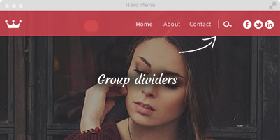
We have built a very intuitive and visual way to style your navigation. This allows you to style every aspect of your navigation, but leaving most of the items on this page as default will be a good design.

CONTENTS:
Menu bar dimensions
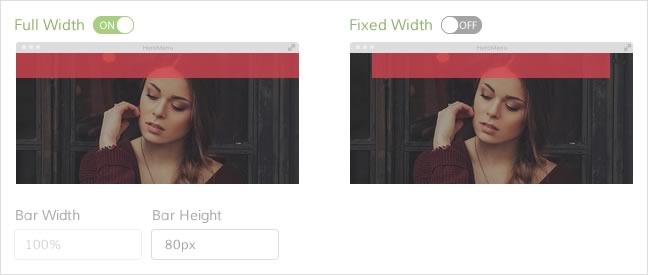
Setting up your menu bar dimensions is an easy 2 step process by clicking the bar width and then choosing the content width.
Choose between a navigation bar that runs the full width of the screen or at a fixed width. (Bound by the parent div container that wraps the HeroMenu navigation)
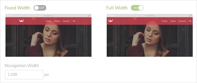
Choose between navigation items that runs the full width of the navigation bar, or a fixed width in the centre of the navigation bar.
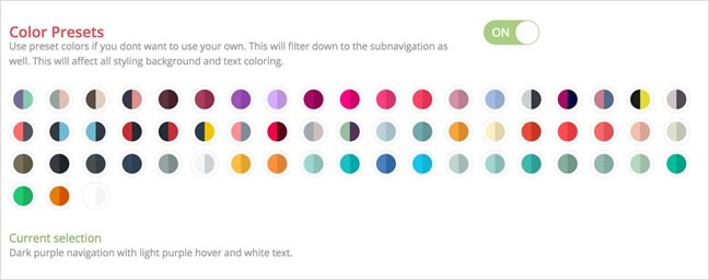
Color presets
Using our preset colors enable you to select a color example, this will then filter through the whole menu, from the main menu, down to the sub navigation and mega menu.
Background color
Use your own custom colour by adding in a hex value, or use our color picker. You can also add css gradients in your navigation, by clicking on the “Gradients” button and then selecting or adding your second colour. Gradient orientation can also be changed from vertical to horizontal.
Also change the menu bar transparency as needed.

Hover type and color
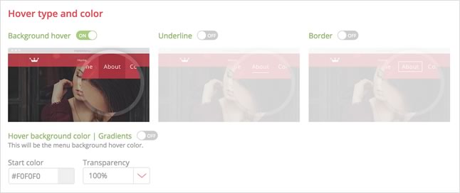
Choose from 3 different types of hover effects. Background hover, Underline and Border. Each one of these hover effects can be styled with your own color.
Menu border
Switch on the the border button and you can add a thin, 1 pixel border around your navigation bar. You also have the option to only add the border to one of the sides. The colour and transparency can also be changed.
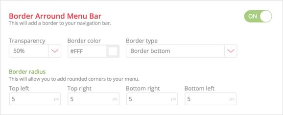

Add rounded corners to your menu bar by changing the border radius.
Fonts
Choose between more than 650 Google fonts from the dropdown. Edit size, weight , color and hover color.

Navigation item padding
If you feel you need to change the distance between your nav items, feel free to change the padding here. The default setting should be fine.

Menu shadow
This will add a shadow to your menu bar. Please note that this function is not supported in older browsers.
Logo and Mobile logo
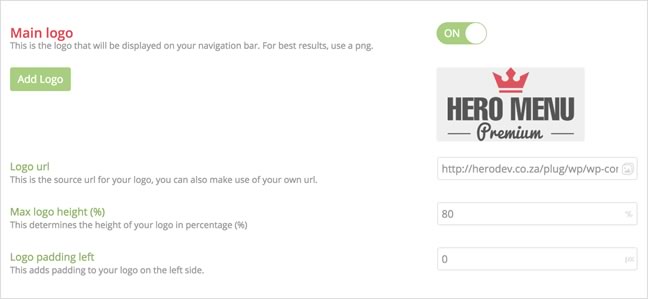
Add a logo to your navigation and add a link if you want the logo clickable. The logo size can be changed by giving it a percentage of the menu bar height. Use a transparent PNG, preferably 600px by 600px.
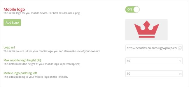
We give you the option to have a replacement company logo when the navigation collapses into a mobile nav.
Sticky Menu
Sticky navigation (also called a fixed navigation) is basically a website menu that is locked into place at the top of the screen so that it does not disappear when the user scrolls down the page; in other words, it is accessible from anywhere on the website without having to scroll.
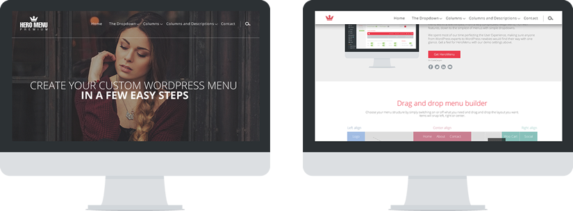
Activating this will give you a few extra options, like when you want the menu to activate, size, transparency, menu bar color, text color, text size and a different logo if needed.
Here is an example of a menu that becomes a sticky menu when you scroll down.
Navigations arrows
This will enable a small dropdown arrow next to all dropdown navigational items.

Line and group dividers
Line dividers are lines between navigational items.
Set the transparency, color and size.
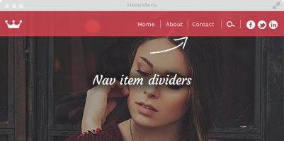
This will add a group divider item between your navigational sections.
E.g. WooCart, Search, Social
Set the transparency, color and size.
