The Styling tab contains the settings that control the visual appearance of your slider and its navigational elements. Please keep in mind that these settings are global and applies to the entire slider.
Navigation Arrow Styling
This section toggles and controls the appearance of a slider’s navigation arrows. When switched off, no navigation arrows will appear on your slides.
You can choose between 7 arrow styles, and adjust their primary and secondary colors. The two images below the dropdowns and color pickers provide you with a static preview of the arrows as they will appear on your slider, but will not take your color choices into account.
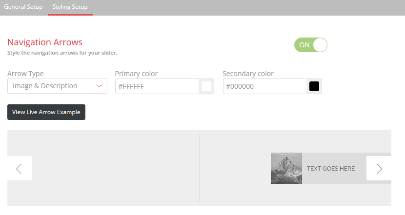
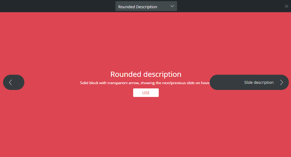
Clicking on the View Live Arrow Example button will open a pop-up, which will provide you with an easy way of previewing the different arrow styles – clicking on the Use button will update the setting and close the pop-up. Please note, however, that neither the static or live previews will take your color choices into account.
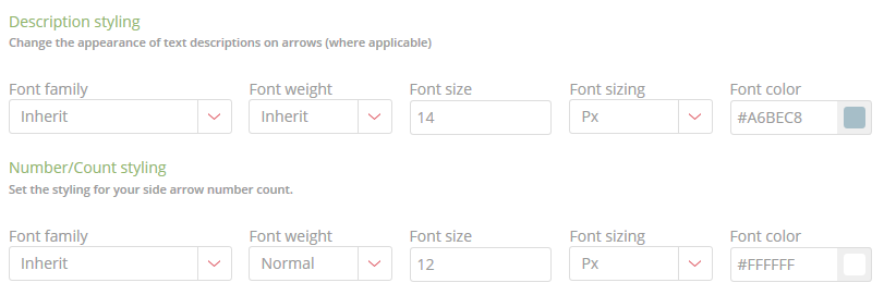
You may notice, while going through the various styles, that some of the navigation arrows have descriptions and numbering text elements. The format and appearance of these can be changed in the Description Styling and the Number/Count Styling sections pictured below:
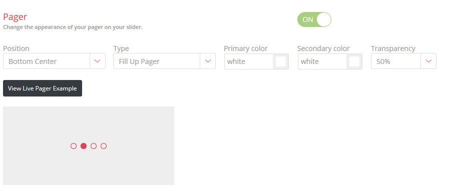
Pager Styling
This section toggles and controls the appearance of a slider’s pager. When switched off, no pager will appear on your slides.
The plugin includes three different pager styles, and you can adjust their primary and secondary colors, while also specifying the placement of the pager on your slide. As with the navigation arrow controls, you can see a static preview of the styles, but also see a live example by clicking on the View Live Pager Example button.
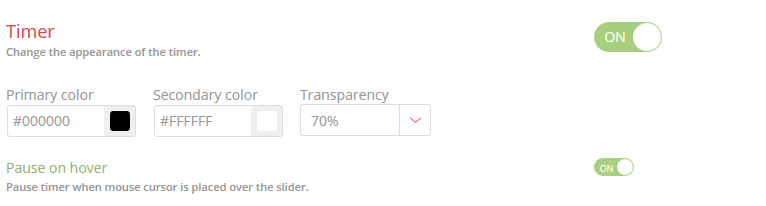
Timer Styling
Hero Slider allows you to have a timing progress bar underneath your slides, which can be toggled on or off in this section
Other settings will allow you to adjust the color and transparency of the timer, and you also have the option of pausing the timer when a user hovers their cursor over the slider.
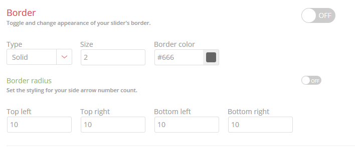
Border Styling
Enable or disable and style your slider’s border. This option is off by default – switching it on will enable a border on your slider and allow you to choose one of three different border styles, along with the border width and color. The border controls also support rounded corners for your border, and you can individually adjust the settings for each corner.